Adjusting layouts with media queries
So far we have only been building sites optimized for large screens. In today’s world, however, smartphones have become the most popular way to browse the internet. As such, you will need to learn how to build for smaller screens as well as big ones, and everything in between. Media queries are a good place to start. Watch this video and this one to learn how to add media queries to your project.
Additional Resources: http://htmldog.com/guides/css/advanced/mediaqueries/
Summary
Media queries in action:
/***************************
Exhibit A
***************************/
@media screen and (min-width:600px) {
nav {
float: left;
width: 25%;
}
section {
margin-left: 25%;
}
}
/***************************
Exhibit B
***************************/
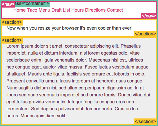
@media screen and (max-width:599px) {
nav li {
display: inline;
}
}
Exhibit A:
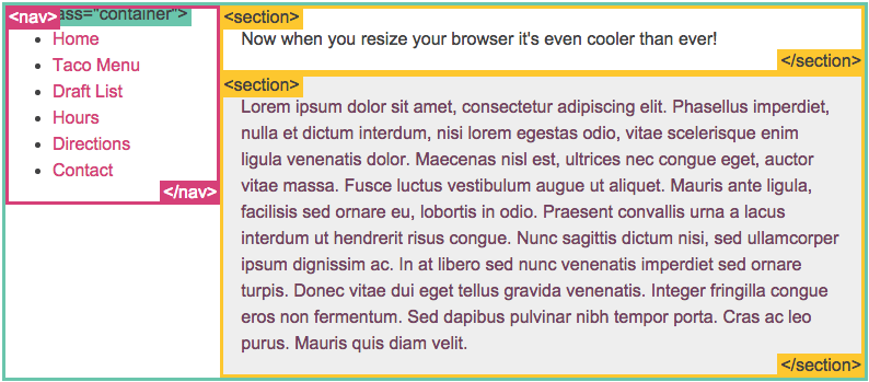
Exhibit B: