Views and View Groups
Every item in a user interface is a subclass of the Android View class (to be precise android.view.View). The Android SDK provides a set of pre-built views that can be used to construct a user interface. Typical examples include standard items such as the Button, CheckBox, ProgressBar and TextView classes. Such views are also referred to as widgets. For requirements that are not met by the widgets supplied with the SDK, new views may be created either by subclassing and extending an existing class, or creating an entirely new component by building directly on top of the View class. A view can also be comprised of multiple other views (otherwise known as a composite view). Such views are subclassed from the Android ViewGroup class (android.view.ViewGroup) which is itself a subclass of View. An example of such a view is the RadioGroup, which is intended to contain multiple RadioButton objects such that only one can be in the “on” position at any one time. In terms of structure, composite views consist of a single parent view (derived from the ViewGroup class and otherwise known as a container view or root element) that is capable of containing other views (known as child views). Another category of ViewGroup based container view is that of the layout manager.
Android Layout Managers
In addition to the widget style views discussed in the previous section, the SDK also includes a set of views referred to as layouts. Layouts are container views (and, therefore, subclassed from ViewGroup) designed for the sole purpose of controlling how child views are positioned on the screen.
The Android SDK includes the following layout views that may be used within an Android user interface design:
- LinearLayout – Positions child views in a single row or column depending on the orientation selected. A weight value can be set on each child to specify how much of the layout space that child should occupy relative to other children.
- TableLayout – Arranges child views into a grid format of rows and columns. Each row within a table is represented by a TableRow object child, which, in turn, contains a view object for each cell.
- FrameLayout – The purpose of the FrameLayout is to allocate an area of screen, typically for the purposes of displaying a single view. If multiple child views are added they will, by default, appear on top of each other positioned in the top left hand corner of the layout area. Alternate positioning of individual child views can be achieved by setting gravity values on each child. For example, setting a center_vertical gravity on a child will cause it to be positioned in the vertical center of the containing FrameLayout view.
- RelativeLayout – Probably the most powerful and flexible of the layout managers, this allows child views to be positioned relative both to each other and the containing layout view through the specification of alignments and margins on child views. For example, child View A may be configured to be positioned in the vertical and horizontal center of the containing RelativeLayout view. View B, on the other hand, might also be configured to be centered horizontally within the layout view, but positioned 30 pixels above the top edge of View A, thereby making the vertical position relative to that of View A. The RelativeLayout manager can be of particular use when designing a user interface that must work on a variety of screen sizes and orientations.
- AbsoluteLayout – Allows child views to be positioned at specific X and Y coordinates within the containing layout view. Use of this layout is discouraged since it lacks the flexibility to respond to changes in screen size and orientation.
- GridLayout – The GridLayout is a relatively new layout manager that was introduced as part of Android 4.0. A GridLayout instance is divided by invisible lines that form a grid containing rows and columns of cells. Child views are then placed in cells and may be configured to cover multiple cells both horizontally and vertically allowing a wide range of layout options to be quickly and easily implemented. Gaps between components in a GridLayout may be implemented by placing a special type of view called a Space view into adjacent cells, or by setting margin parameters.
When considering the use of layouts in the user interface for an Android application it is worth keeping in mind that, as will be outlined in the next section, these can be nested within each other to create a user interface design of just about any necessary level of complexity.
The View Hierarchy
Each view in a user interface represents a rectangular area of the display. A view is responsible for what is drawn in that rectangle and for responding to events that occur within that part of the screen (such as a touch event).
A user interface screen is comprised of a view hierarchy with a root view positioned at the top of the tree and child views positioned on branches below. The child of a container view appears on top of its parent view and is constrained to appear within the bounds of the parent view’s display area. Consider, for example, the user interface
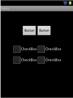
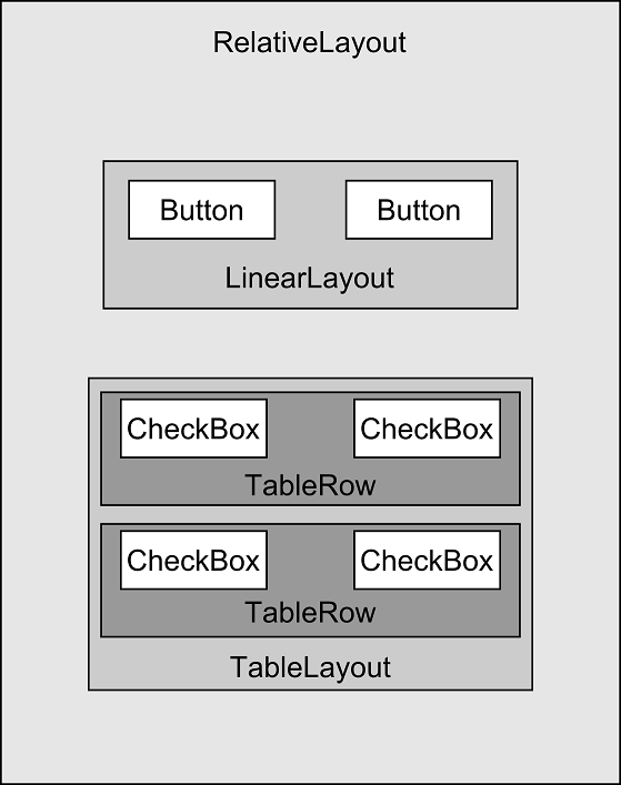
In addition to the visible button and checkbox views, the user interface actually includes a number of layout views that control how the visible views are positioned. An alternative view of the user interface, this time highlighting the presence of the layout views in relation to the child views:
As was previously discussed, user interfaces are constructed in the form of a view hierarchy with a root view at the top. This being the case, we can also visualize the above user interface example in the form of the view tree
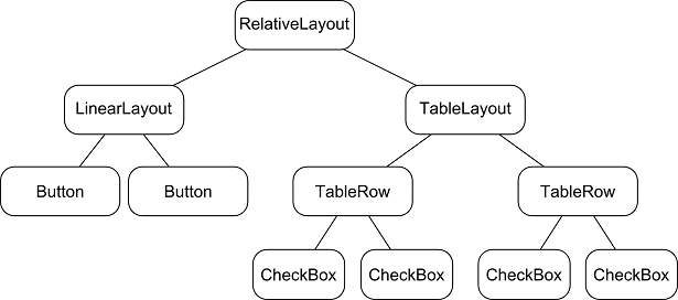
The view hierarchy diagram gives probably the clearest overview of the relationship between the various views that make up the user interface. When a user interface is displayed to the user, the Android runtime walks the view hierarchy, starting at the root view and working down the tree as it renders each view.